
Say what you do in the first screen
Most visitors decide within a few seconds whether a page is relevant to them. In that time they should be able to answer three questions: what does this business offer, is it for someone like me, and what should I do next?
That means a headline that names your service in plain words, a short supporting sentence, and one clear action. A clever slogan can work, but only when the sentence beneath it explains what you actually do.
- Name the service or product in plain language
- Say who it is for, or where you work
- Give one primary action, such as "Book a call" or "Get a quote"
Organise pages the way customers think
Navigation should follow the questions your customers ask, not the structure of your company. A visitor looking for prices should not need to guess whether they are under "Solutions", "Packages" or "Resources".
Keep the main menu short, use everyday words, and make sure every important page can be reached in one or two clicks. If people often email you the same question, that answer probably deserves its own page or a clear place on an existing one.
Design for the phone first
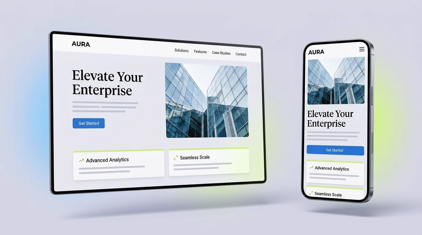
For many businesses, a large share of visitors arrive on a phone, often in a hurry. A layout that works beautifully on a desktop can become a long, crowded scroll on a small screen.
Mobile-first design means deciding what matters most on the smallest screen, then adding detail as space allows. Buttons should be large enough to tap, text should be readable without zooming, and contact options such as calling or WhatsApp should be easy to reach.
Treat speed as part of the design
A slow page loses people before they have read a word. Speed is shaped by many small decisions: the size of images, how many scripts and fonts load, and whether large effects are used where they are not needed.
Good practice includes compressing and correctly sizing images, loading only the code a page needs, and testing on a real phone, not only on a fast office connection. Animation can still be part of a fast site when it is planned with performance in mind.
Give every page a purpose and a next step
Each page should have one main job: explain a service, answer a question, or help someone get in touch. When a page tries to do everything, visitors are left unsure what to do next.
End important pages with a clear, relevant action. A service page might invite a quote request; an article might point to a related service. The wording matters too: "Get a written quote" says more than "Submit".
Earn trust with real information
Trust is built from details that are easy to check: a real email address, clear contact options, an honest description of how you work, and visible privacy and terms pages. Explaining your process and what is included in your price also helps people feel confident before they contact you.
Avoid shortcuts such as invented reviews, borrowed client logos or numbers you cannot support. They can damage trust quickly, and they are rarely needed when the rest of the site is clear and honest.
Make it usable for more people
Accessibility is part of good design. Readable text sizes, good colour contrast, descriptive link text, keyboard navigation and alt text for meaningful images help people with disabilities, and they usually make the site easier for everyone.
Motion should also respect visitors who have asked their device to reduce it. That can be as simple as replacing large movements with a gentle fade.
Keep it up to date
A website is not finished on launch day. Services change, prices change and new questions appear. Outdated information is one of the quickest ways to lose a visitor's confidence.
Plan who will update the site and how. If your team will make regular changes, a content dashboard can let them edit text, images and articles without needing a developer each time.
Thinking about this for your own business?